
Eneko Rojas is the Brand and Strategy Director at Peldaño, a publishing company that successfully transformed into a B2B communication group. Working closely with him, we executed a comprehensive branding project for the company, aimed at helping them better understand their audiences and improve their ability to reach them with a tone of voice and brand personality tailored to their reality. The project also had a significant focus on brand architecture, which helped organize the entire portfolio.
Tag: Design
Is it possible to renew the image of a football club without getting burned?

Football brands are sacred but not eternal
A couple of weeks ago we knew about the rebranding of Real Valladolid C.F. and, as usual when a team touches its emblem, the change set the networks on fire again. A phenomenon that we have already experienced with brands such as GAP, Airbnb or Pepsi but never at this level.
Does this mean that identity in soccer is an untouchable grail? Soccer team brands also age and must evolve to remain relevant and express the reality, the moment and the values of their clubs.
Hasn’t the players’ kit evolved? Let’s remember the mini shorts of Di Stefano’s era?
Is it therefore heresy to redesign a club’s crest? The visual identity of the teams should be able to adapt to the new times and needs without so much fuss.
Because it’s not just heraldry. We have seen controversy in subtle restylings (the case of Barça) and in more radical rebrandings (the case of Juventus). Whether because of the emotional component, the feeling of belonging or the historical legacy, the members of a soccer club are diehard fans; brand lovers who feel co-owners of the brand and for whom their club is an important part of their identity. And here we enter a minefield?
Is this a participatory process? Although it is always good to have the opinion of fans, former players and specialized historians, it is impossible not to offend sensibilities. A club brings together very different people for whom its team evokes different and profound memories and meanings.
In short, the rebranding of a soccer club will always be a controversial project to tackle and as much desired as feared. A process that gives us the opportunity to become part of the lives of thousands of people but also puts us in the spotlight of all eyes… Good luck to the next ones 😉
Why is good design important in ‘the public’?
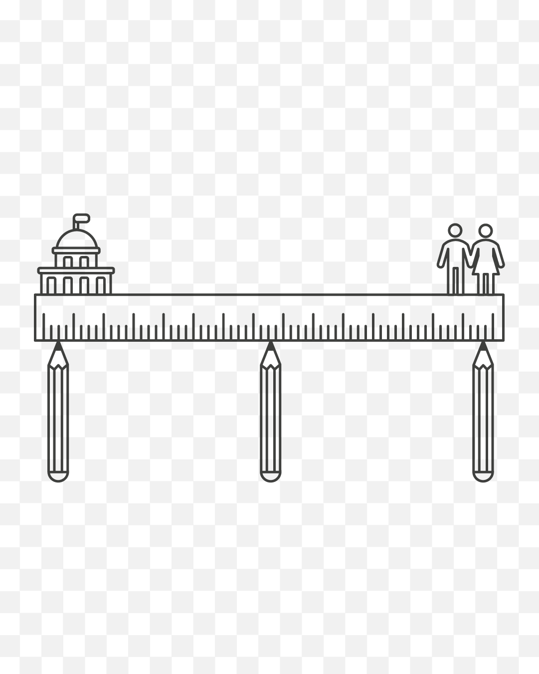
The Administration must serve the public in both form and substance.
If design and good communication are effective and widespread tools in the business environment, why are they not also used in the public sector?
One only has to observe the controversies that arise every time something public is redesigned, with better or worse success, to realise that there are many who consider design as something merely aesthetic. An artistic and accessory element for which public money should not be spent.
In the face of this perception, we must explain that design is much more and that, when used well, it is a very powerful tool for an administration that, in addition to managing, must know how to communicate effectively both what it does and the consequences that its management has on the people.
Because good design is more than just finding a beautiful and creative piece. Good design has an impact on the target audience, increasing the effectiveness of communication. Good design modulates tone and language, facilitating understanding and connecting emotionally. Good design makes procedures intuitive and accessible to all groups regardless of their socio-cultural level. In short, good design reduces the distance between citizens and the administration.
Because, as Louise Downe, the former Design Director of the UK Government, says, the citizen is a user and not a client and, unlike the client, the citizen has no choice but to deal with government services day in and day out.
For this reason, it is essential to redesign the administration in a way that, once and for all, brings public administration closer to the street, facilitates the completion of bureaucratic procedures, encourages political participation and, above all, empowers the citizen.
Are we facing brand homogenisation?

Brands with more uniform logos but with new ways to stand out.
We recently talked about how trends affect branding. Today we want to approach the subject of trends from a phenomenon that we have been observing in recent years in the world of brand design: the homogenisation of logos in some sectors such as fashion or technology apps.
From Burberry to Balenciaga, passing through Yves Saint Laurent, fashion firms have been moving away from serifs, light bodies and italics, to adopt a sans-serif style in a tall box that somehow standardises the haute couture industry.
The same is true when we enter the start-up ecosystem. While this world has specific needs in terms of usability that make some graphic solutions more suitable than others, we believe that there is plenty of room to come up with a personal and distinctive brand. You only have to look at Mailchimp’s rebranding to understand that there is life beyond logos with dry stick typography.
And it’s not just with big brands, there is a growing feeling that there is less and less variety in logos. In the past, designers lived more isolated from the work of others, which meant more freedom and braver proposals. Knowing the trends conditions us, makes us fall into what is popular, what is accepted by the majority. A phenomenon, that of homogenisation, which arises in a globalised and hyper-connected world, but which perhaps also has to do with the current of ‘liquid branding’, which advocates other ways of generating brand recognition and influence.
Because one thing is certain: the perception of a brand goes beyond the logo. We can be equally or more differentiated through the brand narrative, the art direction, the visual and typographic treatment, etc.
In any case, it is vital to understand that if we do not make this effort and let ourselves be carried away by the trends that surround us and what others are doing, we will end up creating perishable and meaningless brands.
What can brands do for feminism?
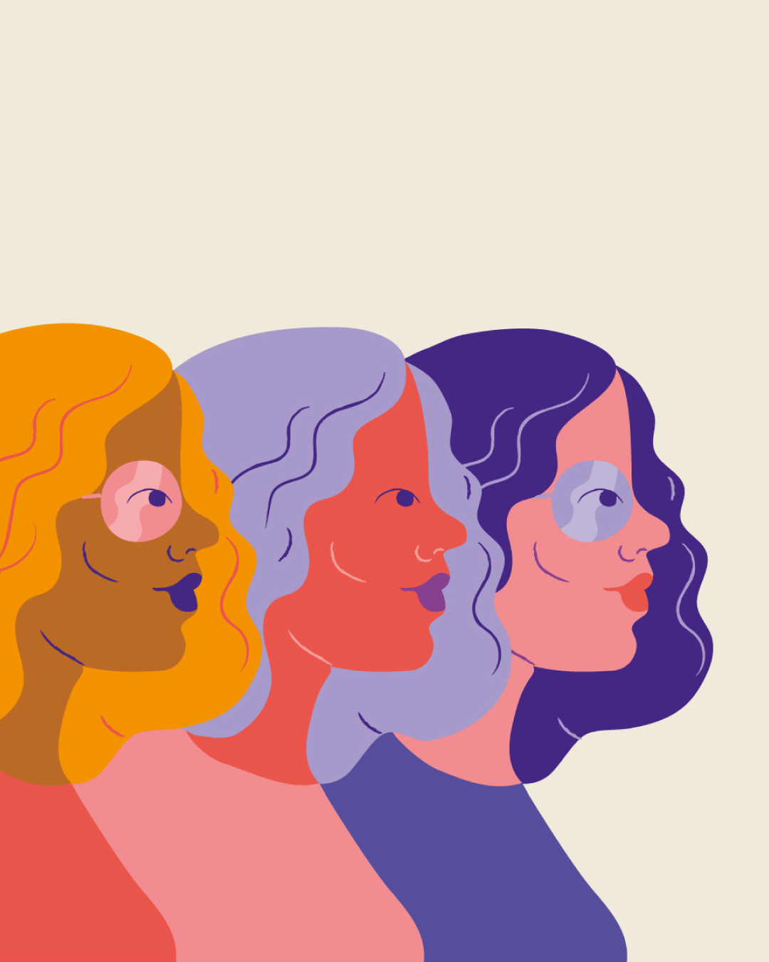
Building the model of society in which we want to live.
Brands are a reflection of the social reality in which we live, but they are also an engine for change. Advertising, branding and communication play a very important role in normalising and implementing the social changes that emerge in our societies.
Although there is always a certain commercial interest behind this, we cannot underestimate the power and influence of brands on the population as a whole, both in reinforcing stereotypes and in breaking them.
Brands and products are part of our daily lives and that is why it is so urgent that, as consultants, designers and communicators, we learn to identify the biases that exist in the system and try to correct them. Being aware of issues such as the fact that the majority of voice assistants are women, or that the ergonomics of cars are designed for the comfort and safety of the male body is the first step in rethinking what we need to redesign in order to have the kind of society we want.
Because while there is a sector of brands that only seeks to jump on the bandwagon of a highly profitable mass movement through small, purely aesthetic and opportunistic gestures, we also find examples of truly committed brands that understand that relevance and real impact come from taking action.
An action that can be materialised in different ways: from attitude, empowering women; from information, giving them visibility and tools; but above all from design, including them in decision-making.
Because although it is great to see us starring in egalitarian spots and advertisements, it is much better to see us directing these campaigns, presiding over companies, and being a point of reference.
Because the present we design shapes the future we will be.
How trendy should a visual identity be?

Brand design must transcend trends, but also take advantage of them.
The accelerated pace at which we live means that many trends are born and die at the same pace. What works today is likely to be obsolete in a few months. It is no longer like before, when a certain trend or movement prevailed in a more obvious way, now many different design trends coexist at the same time. That is why it is so dangerous to entrust the design of a brand to a merely aesthetic fashion.
A maxim of branding is that it should be functional, but it is also true that brands cannot (and should not) completely abstract themselves from what is happening around them, trends included. We must not forget that visual codes appeal to the social imaginary and are linked to a popular understanding. In this sense, the concepts of “modern”, “classic” or “technological” are not static but vary with the historical moment.
Good design handles this with great skill, always finding the balance between trend and universal codes, those that steer clear of the volatility of taste. A good brand design will find current graphic solutions and at the same time contain that intrinsic ‘truth’ to the brand that makes it solid and different from the base.
Branding must be approached from a long-term perspective and, although it is fine to play with the trends of the moment, we must know how to choose them. We must transcend the trend or the designer’s own style and think about what the project, the sector or the specific client demands. Before being guided by a particular trend, we must consider whether it is relevant to our category, our current positioning or the consumer group we are targeting.
Why do so many tech brands use illustration?

Technology needs poetry to excite.
Not only Google, but also Shopify, Mailchimp or Dropbox… Every day more and more startups and tech companies are developing their own brand illustration system to better connect with their users.
Whether with the aim of simplifying ideas, humanising digital products, differentiating themselves from the competition, or generating brand recognition, illustration is a vital communication tool for today’s technology brands.
Gone are the days of literal icons and in favour of freer, more expressive brand illustration that, like words, helps us to modulate our brand personality according to our purpose and audience. Illustrations are now much more sophisticated and no longer simply translate the engineer’s complex innovations into user benefits, but form a whole brand language that conveys our story in a more relatable way.
The design of the future: multidisciplinary or specialised?
The combination of profiles enriches projects and stimulates teams.
As the field of visual communication has expanded, the boundaries of design have also blurred, encompassing more and more disciplines and formats. This has forced us to add a surname to the profession, giving rise to editorial designers, product designers, UX designers, and an endless list of specialisations. A necessary specification that is sure to increase, but which coexists with the demands of a market that continues to demand the figure of the “all-rounder” designer.
In such a changing and demanding context, forming ad hoc teams, in which multidisciplinary designers work together with specialists, is undoubtedly the way to make a difference, not only in the response given to the client but also in the result of the work and the way in which it reaches the audience.
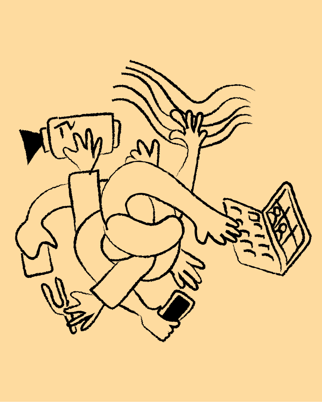
Can design save your life?
Good design can make a difference.
In a world hypersaturated with impacts where we only process a small percentage of the messages we receive, good design can make the difference. A few days ago we saw how the interactive infographics of an article, explaining how COVID is spread in different spaces and situations, went viral. And more and more media are betting on infographics to capture the attention of their audience and make their content transcend.
The reality is that we are more permeable to what we see than to what we read; the visual connects with our emotional level and is better fixed. Making the most of the tools that design gives us is key to meeting the challenge of exposing complex realities and providing credibility. A vital aspect when we deal with such crucial issues as health, security or education.